The Actual News:
Hey y’all, Nick here!
I hope y’all had a Merry Christmas! I definitely did. So much so that I forgot to do my yearly Christmas “Oak is a lying bastard!” Wonder Trade—where I load up a bunch of Fearows and Tentacruels with Master Balls—but then again there’s no PokéGen for Sword/Shield…. yet….
Anyways, since I wasn’t handing out free Master Balled Fearows, I spent my time working on the new Neo Blanks for the GS Beta Space World set. It’s far from completion, but I do want to share what I’ve done so far.
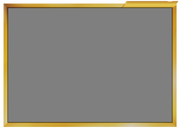
First off, here’s the “Neo A” picture border and Pokémon stage bar.
The darkened bits of the border is actually the bleed. The image will actually cover it, but in case the picture is slightly shorter or narrower, the border won’t look cropped or missing anything.

Now as a reminder…
I call it “Neo A” because, for some reason, WotC changed the card layout used between Neo Genesis and Neo Revelations, making Neo Destiny’s card design look slightly different. It’s different enough that I consider its design “Neo B”.
Meanwhile, I’ll call the Japanese Neo style “Neo J”.
The overall goal is to make a somewhat unique Neo blank which combines the look of all three styles. Or maybe not. I’m definitely going to use the “Neo A” style as a base, which is why I did its border first. We’ll see how much of the rest I’ll incorporate…
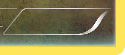
And finally, here is a couple examples of the kind of blanking I’ve been experimenting with. Seeing as I’m going to be including  Dragon- and
  Fairy-types in the set, I’ll need to get some backgrounds for them. And here are some test examples of them.


The problem I’m having with them is that… the background behind the flavor text is somewhat dull. Or at least, that’s what I’ve been able to generate. I mean, like, I can’t quite tell if the actual background was intentionally dull in the part that would be behind the flavor text, or id my efforts to blank it put made it look dull.
Even more concerning is like… normally it wouldn’t bother me, because normally that section would be covered up in an actual fake card anyways, so it wouldn’t be noticed. However, it’s going to be used in a completely different blank, so that section will be more visible than it normally would.
Meh, I’m probably making this sound like more of an issue than it really is. It’ll probably be fine in the grand scheme of things. …. …or at the very least, no one will notice. 
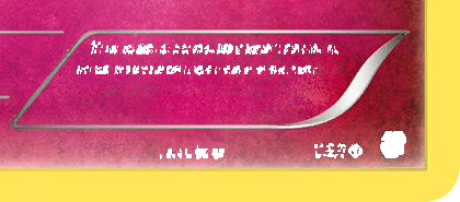
UPDATE: OK, I worked out a quick-and-efficient system which allows me to blank out text at a much higher quality than I had previously had been able to create. This was what I was able to create in far less time than it took to make the previous examples. Yay!


It may not look like much, but these are definitely higher quality AND more authentic than the previous versions.
And that’s that! The rest should come just as easily.
