Like all good ideas, the Pokémon TCG did not spring to life fully formed. Rather, it went through a long process of iteration and refinement before we got to where we got to now.
Recently, a couple of high-profile CGC grading and auctions have given us a window into what this process looked like, from the absolute very first test prints all the way up to the days before official release. This page covers all of those steps (and then some), covering not just what they looked like, but what they wanted to see happen, as well as what got added or removed with each step.
(This page is VERY new! Please watch out for updates and proper credit info for each entry!)
 |
|
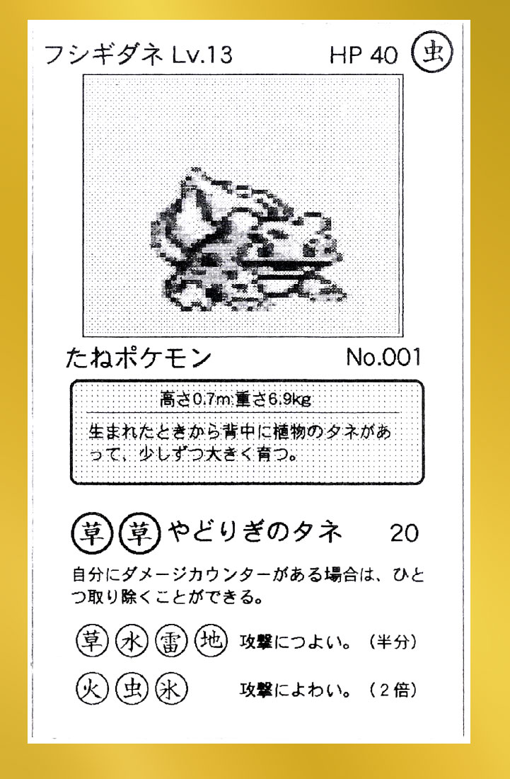
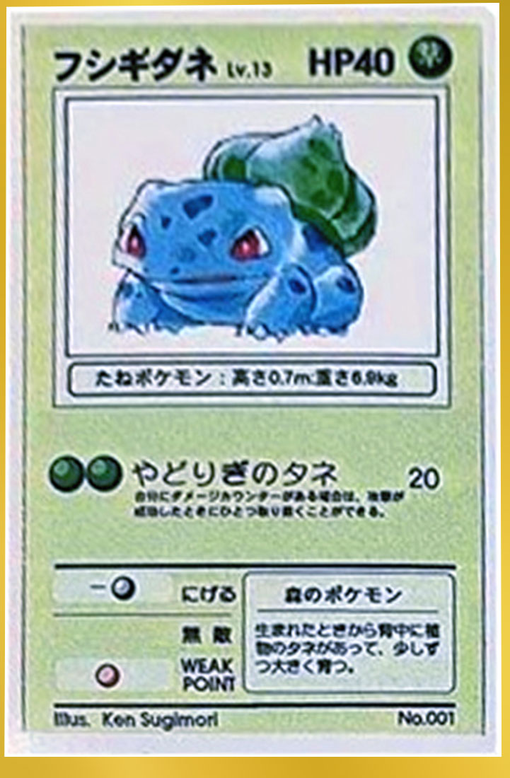
This was the very first prototype card design, back when Ishihara whipped up a few examples using Pokémon Red/Green sprites and a word processor (almost certainly one called ClarisWorks).
KEY DESIGN NOTES:
- All the way up to the final release, the card designs are actually relatively narrow, almost hanafuda in dimension.
- Hanafuda dimensions: 1.3″ x 2.1″ / 32 x 54 mm (1:1.6875 ratio)
- Final card dimensions: 2.5″ x 3.5″ / 63.5 x 88.9 mm (1:1.4000 ratio)
- These prototype card dimensions: 626 x 1022 px (1:1.6326 ratio)
- The fundamentals of the Pokémon TCG was established here: HP, Energy for Attacks, Weakness, Resistance, Coin Flips, etc. You could very easily slot this into a deck and use it!
- Meanwhile, other concepts like “Evolution” and “Retreat Cost” did not exist. For example, other Pokémon that ended up being “Evolution” cards were “Basic” cards during this initial design. And given that retreating was free in the video game, they didn’t consider having it as a cost like it is in the TCG.
- Although the idea of types and symbols remained essentially what it is today, their details were still in flux. Specifically, the types used on the cards were the actual types from the video game and were denoted by kanji. The only type which DIDN’T have a kanji character for it was “Normal”/Colorless type, which was simply an empty shaded circle.
- Due to the video game types being used, Pokémon weaknesses and resistances were similar to what it was in the video game; all Pokémon were given multiple weaknesses and resistances. That said, resistance worked different: it halved the damage versus doing 30 less damage.
- They also didn’t actually use the terms “Weakness” (弱点) and “Resistance” (抵抗力). Rather, they straight up told you:
- 攻撃につよい。(半分) = “Strong against other attacks (Half)”
- 攻撃によわい。(2倍) = “Weak against other attacks (2x)”
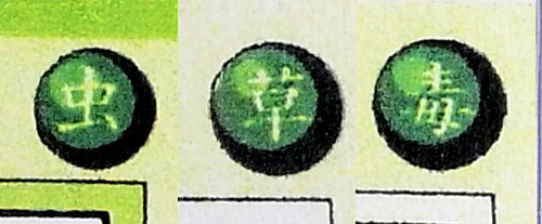
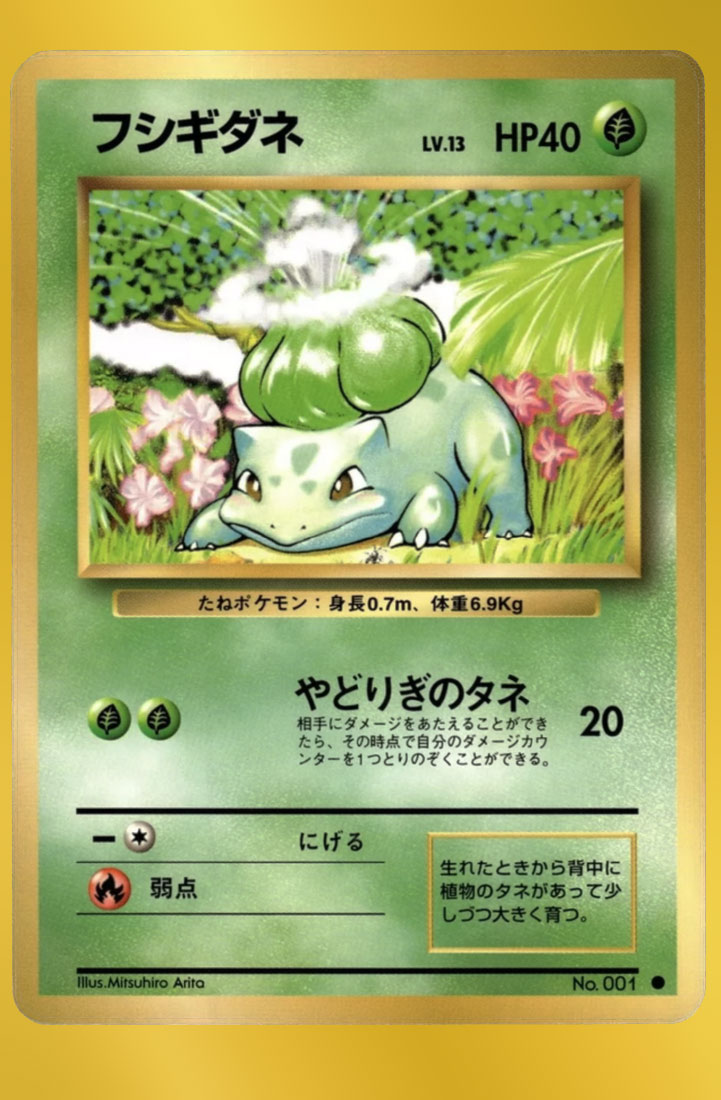
- So Bulbasaur’s case, the kanji/type symbols used were:
- TYPE: (虫) = b — yeah for some reason Bulbasaur is a Bug-type.
- ATTACK: (草)(草) = g g — technically the video game “Grass” type, not the TCG Grass type (ZG ZG)
- Its attack, やどりぎのタネ (Leech Seed), basically remained the same attack all the way up to the final release: 自分にダメージカウンターがある場合は、ひと つ取り除くことができる。(If you have any damage counters, you can remove one of them.)
- RESISTANCE: (草)(水)(雷)(地) = g w l a
- WEAKNESS: (火)(虫)(氷) = f b i
- 26 known cards exist from this era.
|
 |
|
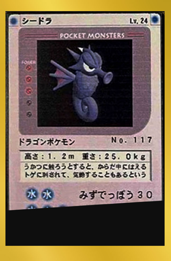
This “Game Boy Seadra” was the next step in the original card design (note that the flavor text is inbetween the artwork and game text. However, since this has been the only card of this design, this might have just been a one-off to test card designs. For all we know there may be other one-off designs as they were working to formalize the game.
KEY DESIGN NOTES:
- Naturally this card design is based off the original Nintendo Game Boy design.
- Its type is seen a blue dots in both corners, but it would go back to the single type icon later.
- The purpose of multiple “Power” icons to the left of Seadra is unknown. Aside from it being a reference to the Game Boy’s Power light, it might have also been an early “retreat” concept. But that’s only my guess.
- Otherwise this card keeps the same gameplay concepts of the previous design.
|
 |
|
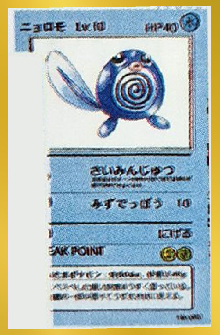
This could be another one of those one-off designs… however, this one seems to bridge the gap between the very first prototype design and the next subsequent “Alpha” design stage.
KEY DESIGN NOTES:
- It still uses the multiple weaknesses seen from the original prototype design (designated as “WEAK POINT”).
- The flavor text and info bar—which were originally inbetween the artwork and the attacks—were now placed in the bottom.
- (Originally sources from ??? post; will post link and credit soon.)
|
 |
|
This is the CoroCoro design, as seen in the issue covering the Pokémon TCG. As you can see, it very much looks like the original Alpha- and Beta-era designs to come… but, it’s placed before them in the timeline??
Yes, after rigorous research, I have good reason to believe that the CoroCoro design was developed BEFORE the subsequent Alpha and Beta designs instead of after, and that those Alpha and Beta designs were instead made to look like the CoroCoro design. More specifically, the CoroCoro design was used concurrently with the Alpha and Beta designs. I’ll explain more below.
KEY DESIGN NOTES:
- This stage maintained similar design cues from the Alpha and Beta designs:
- The narrow hanafuda card ratio
- The location info above the flavor text
- Any kind of color differences denoting Retreat Cost, Weakness and/or Resistance
- Unlike the Alpha and Beta cards, it uses the TCG symbols… this is one reason why we all thought it was released after Alpha/Beta (as those lack the icons) but other clues brought that into question.
- The design is otherwise basically what it ends up being; the rest—namely the golden borders + info bar and special background design—are just details.
|
 |
|
The first true Alpha design, also known as either “March Playtest” or “Alpha Playtest”.
This stage went through a great number of iterations… I almost feel like once this design was locked down, cards were edited on a one-off basis. Like, if they made a change to the game, they didn’t redesign and reprint every single card, rather they only printed it out if a significant amount of change had occurred since the previous print.
This stage, for example, kept the English “WEAK POINT”.
KEY DESIGN NOTES:
- As you can see, these cards are maybe 90% exactly as they ended up becoming the final Japanese release:
- Level by the Pokémon’s name
- The info bar broke free from the flavor text and was moved under the artwork
- Flavor text moved to the right-half of the bottom of the card, with the Retreat Cost/Resistance/Weakness (as “WEAK POINT”) on the left.
- Artist name and Pokédex number on either side of the very bottom.
- The 10% which are different include:
- The more narrow hanafuda card dimensions remain (width-to-height ratio of about 1:1.65 versus the final 1:1.40)
- With the info bar moved up under the artwork, in its original place—just above the flavor text—is a unique descriptor explaining WHERE this Pokémon can be found. This would persist across both Alpha, Beta AND CoroCoro designs, but would be removed by its final release. I wonder why?
- Meanwhile, every card’s game text design during this Alpha era are effectively 99% what they ended up in the final release, covering Base Set, Jungle and Fossil, as well as a few promos!
- The HP design is somewhat randomized; most of them appear as the Bulbasaur Alpha cards do, but some have a more “flatter” style.
- Evolution cards make their first appearance here; they are denoted by a darker-colored box in the top part of the card.
- Other established aspects of the TCG which make their first appearance here are Pokémon Powers and Trainer cards.
- The initial seven types were established and each Pokémon was colored accordingly… however their type icon maintained the original kanji (again, except Normal/Colorless Pokémon).
- Some Pokémon were listed without a kanji-type icon (like Hitmonchan), but I’m not sure if this was an error or intentional. It’s worth noting that the Attack, Retreat, Resistance and Weakness icons all lack kanji.
- The fact that they are color coded despite having their specific kanji-type icons means that the green-colored type truly is the “Green” type, seeing as it covers Bug (虫), Grass (草) and Poison (毒) types:
|
 |
|
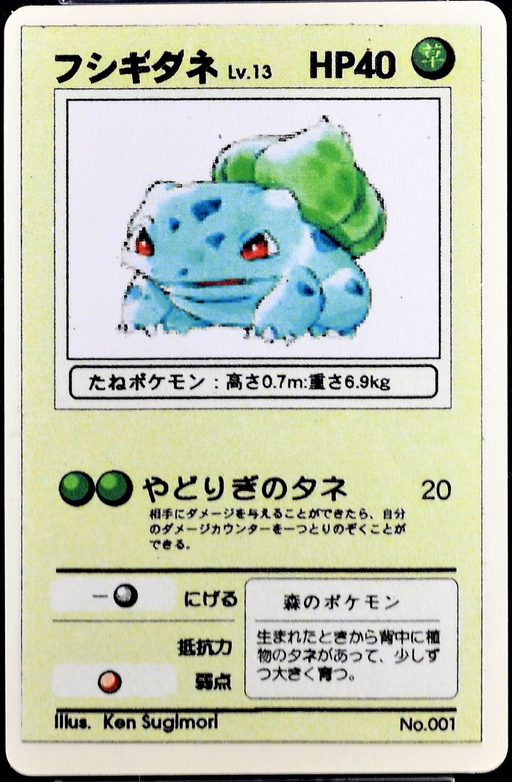
Another iteration of the Alpha design; this one changed “WEAK POINT” to only to “弱点”, which remained as such through subsequent printings. |
 |
|
This stage updated the game text for Bulbasaur’s attack.
That said, this design was very haphazard and somewhat inconsistant; they all have a general idea of how the design is supposed to be (“Retreat cost goes here, Resistance and Weakness go below”, etc.), but the actual application of those elements are done on an ad-hoc manner. When you compare one card to another, you can tell that they simply added in the text elements one-by-one as they went through each card. |
 |
|
This is what I would call the Beta design, also known as “Beta Playtest”. This is similar to the Alpha design, but much more refined. Unlike the Alpha design which was very haphazard, inconsistant and ad-hoc, this one had a very consistant style and clean design. This one also appears to have been made using a professional document design program—such as Aldus PageMaker—which allowed the designers to maintain that consistent design as they created every individual card.
KEY DESIGN NOTES:
- The Game Boy Kanji-types have been replaced with their TCG-types.
- So, for example, a Pokémon like Sandshrew which was “Orange/Ground” type in the Alpha design is now “Fighting” type in the Beta design.
- Initially the TCG types were represented by kanji characters (now including Colorless-type Pokémon), they were ultimately replaced by their TCG symbols.
- This era removed Pokémon Powers for some reason; all Pokémon that had Powers (or would later have them in the final release) were instead given an attack with that Power.
- For example, Aerodactyl’s “Prehistoric Power”/げんしのちから Pokémon Power was instead an attack of the same name. For [FF], it said “during the next turn, Pokémon can’t evolve”. Obviously this caused some serious balancing issues, and so Pokémon Powers would return in subsequent released.
|
 |
|
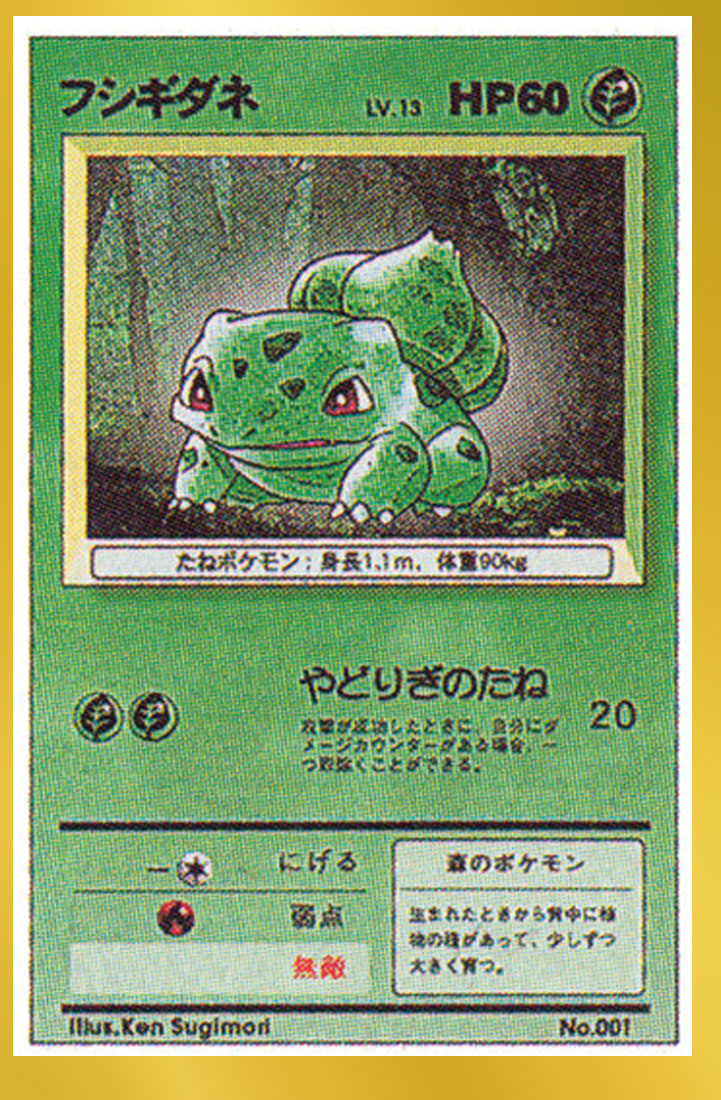
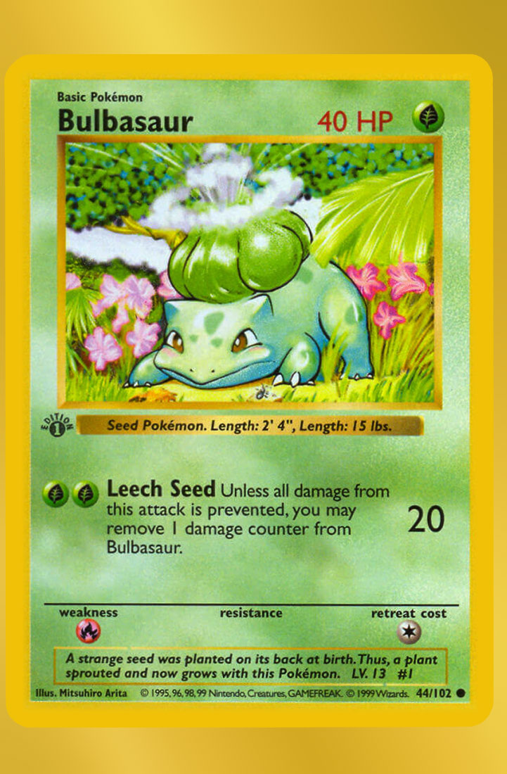
The final release we all know and love!
I chose Bulbasaur for this journey because it’s the one I have the most iterations of, and you can see how much of it actually remained the same since its very first design. |
 |
|
The final Wizards release for North America; you can see what got changed, but also what—albeit coincidentally—looked a lot like the original prototype design (namely the full-width Flavor Text box). |
This is just a quick taste of what’s to come! I plan on showing cleaned up copies of as many cards as I can, as well as showing cards that actually never got released. Stay tuned!
CoroCoro Designs
I’m still ironing out this page, but as mentioned above, it’s clear to me that CoroCoro designs came out before—or at least concurrently—with Alpha/Beta designs. Here’s a quick timeline comparing various iterations of Clefairy Doll and Charizard and where the CoroCoro cards might fit within them:
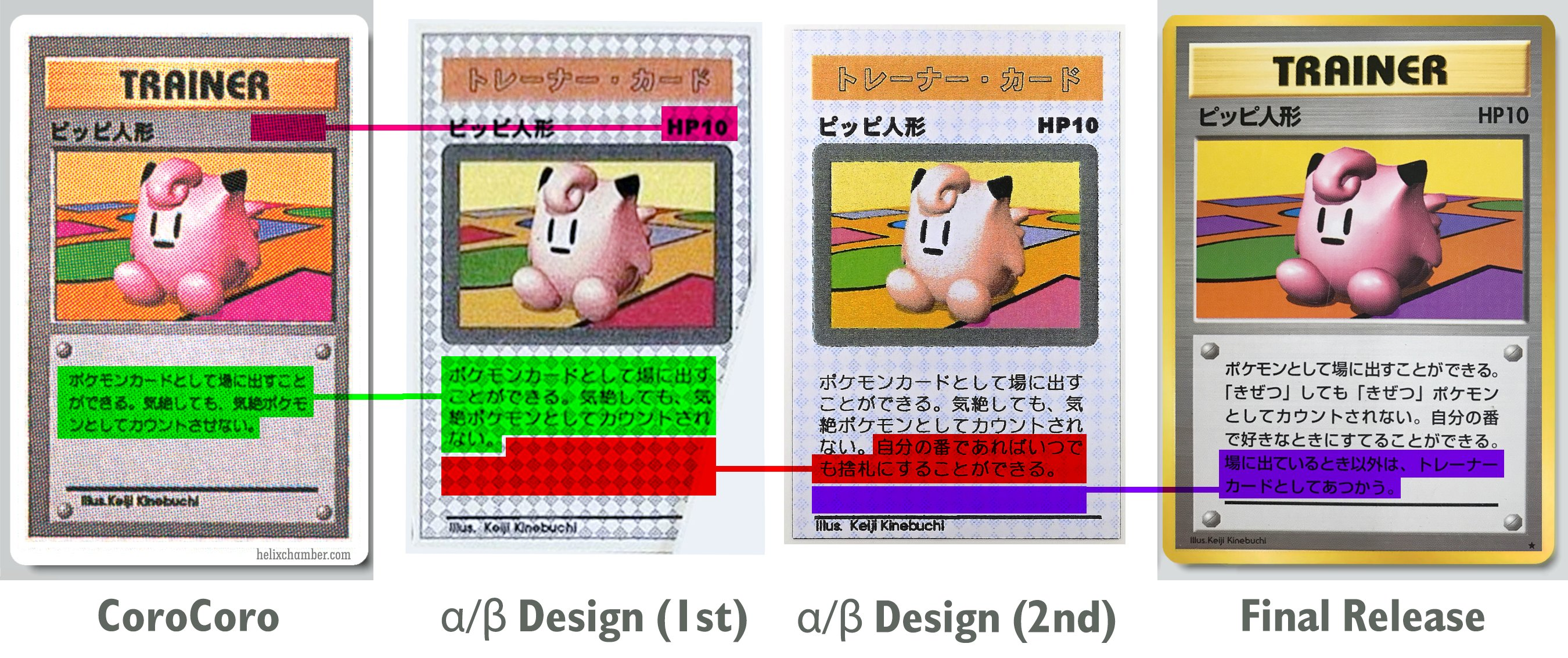
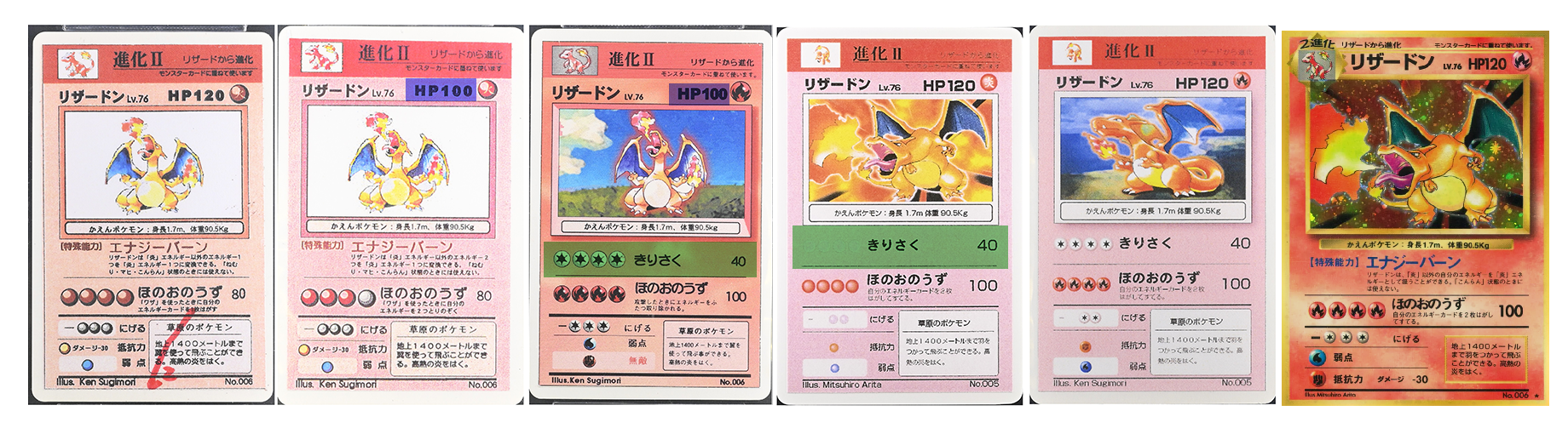
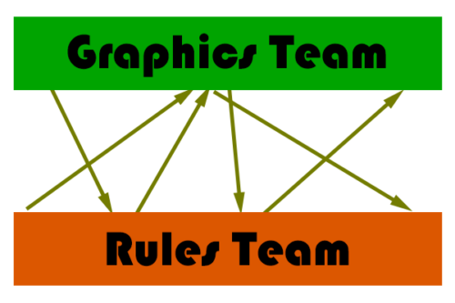
So what does this mean? I mean, it’s pretty obvious when you think about it, but this definitely proves (at least to me) that there were two separate but connected departments during this preliminary Pocket Monsters Card Game development process: the Graphics Team and the Rules/R&D Team. Specifically, the Graphics Team designed the actual cards in order to show them off to potential investors, Nintendo bosses, other executives, while the Rules Team stuck with really simplified designs that they could edit and rewrite as they playtest the game’s mechanics and card designs. Then what probably happened was that the Design Team simply got different slices of different cards at whatever state they’re in from the Rules Team in order to build a “proper” card so that everyone can get a good idea of what it might look like. There was probably a lot of bouncing of ideas back and forth from the Design and Rules team:
In any case, this is the only idea that makes the most sense that accounts for all the different facts provided by what the CoroCoro cards reveal:
- Clefairy Doll with now “HP 10” text
- Charizard with “HP 100” but no Pokémon Power
- Charmander card with what is clearly older preliminary artwork
But that’s just what I think… what do you, the viewers at home, think?